In this article:
Accepted formats for your images
The following formats are accepted in the application:
- JPEG (in RGB): For images in Jpeg, use the RGB format over the CMYK. The CMYK format is mostly used for print and is not always supported in browsers, which can result in display problems in some emailing softwares.
- PNG (8 or 24): The images in the PNG 24 format have the advantage to offer a better image quality and to keep text in images clearer. An other advantage of using the PNG is that it is possible to use clear PNG to create shapes such as a rounded header. On the other hand, PNG files are heavier than JPG; this format is to be used with parsimony.
- GIF: animated GIFS are also accepted. To learn more about this format, click here.
Maximum weight for your images
The system does not accept images bigger than 10 Mb. Do not forget that the bigger the images, the heavier they are and the longer they take to download.
Since emails are opened on mobile more and more, it has to be considered that the time to download an image, usage of the bandwidth and the quality of the internet connection can become constraints for your contacts. Some users even block automatically the download of images to be sure not to go over their internet plan. If your email only contains images, your contact would then miss all of your content. Discover all downsides of only using images in your email by clicking here.
Recommended resolution
The recommended resolution is 72 dpi. A bigger resolution is usually destined for print and will only add to the weight of your email.
Size of your images
- Tip on using an image block
- Tip for images added in a text block
- Tip for images in an expert template
Tip on using an image block
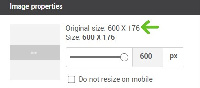
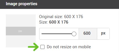
Know the size of your image block
To know the recommended dimensions for our image block, click on image block. Dimensions are written next to the preview.
Optimize your images for mobile platforms
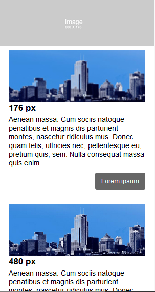
When using an image block, pick images with a width around 600px. To be easily seen on a small screen, most images inserted in an image block will be adjusted to display at full width (or close to) on mobile platforms that supports media queries such as the iPhone. When resized, images with a width inferior to 600px could appear blurry or pixelated.
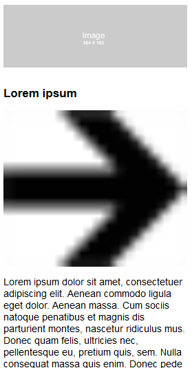
Here is an example of an image inserted in a two image blocks with a width of 176px. It is the same image, in two blocks but the original width of the first image is 176px, so exactly the width of the block. In the second case, the original width of the image is 600px. On a desktop, the difference is not easily seen. However, on mobile here is how two images with differing original width will be displayed. You can see that the image with a width of 600px appears clearer and more defined:
Do not hesitate to preview your mobile version often or, even better, test your mailing with the test mailing tool.
We recommend that you don’t go over 1600px in width and 1200 px in height to avoid unwanted compression of your image when it will be downloaded into the application: It could lower its quality. If your image seems to lose quality after downloading it, reduce its size in a photo editor and download it again into the application.
How to keep the proportions of your image
In predrawn and basic templates, the system will adjust your image automatically to the dimensions of your chosen block. If your image appear crushed or stretched, uncheck the “Use these dimensions” box. The width will remain within the limits of the block but the height will adjust proportionally to respect the original format of your image. If the original width is smaller than the width of your chosen block, the image will appear in its real size.
Focus on consistency
Choose images with the same dimensions, especially if they are on the same line or in the same column. If you do not have images with similar sizes, edit them so they are of the same format. To do so, you can use the “Edit image” button available in all our image blocks. The tools to crop and resize your images will help you obtain images of the same proportions.
Tips for images added in text blocks
Verify the width of your images before adding them
Contrary to the image blocks, images inserted in a text block will appear in their real size. You will need to make sure they are the right size before adding them. If your image is larger than your text block, it could create layout problems such as decentering your email or moving away pictures and texts!
Note: To make it easier to work with the layout of your template and obtain better results, it is best to use image blocks. Insert images in a text block only when absolutely necessary.
Be careful with small images inserted in a text block for mobile display
Pay close attention to small images inserted in text blocks such as social media logos or small icons. On a mobile, any image inserted in a text block is automatically resized to fit the size of the screen. To avoid blurry and oversized images on mobile, you will need to add in the image properties a “noresize” Stylesheet Class.
Here is what small images in a block text look like without a “noresize” class applied:
To do so:
Tips for images inserted in the expert template
In the expert mode, the application does not resize your images automatically to fit the available space. You will need to make sure your images are already the good size before sending them to the server. Here are a few free online picture editing tools to help you: Pixlr, PicResize, ResizeYourImage.
Note: If your images are too big, they may be over the 10 Mb limit accepted by the system. Additionally, your email will take longer to load which is why it is recommended to work on them berforehand.
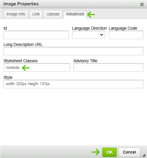
- Right click on your image.
- In the menu, choose Image properties.
.png)
- Select the advanced tab.
- Add the “noresize” text in the Stylesheet Classes field and click OK.
- Verify once again the display with the preview tools.